Thursday, June 19, 2008

Comalle

Comalle is an organic roman typeface that recovers some elements proper of handwritten letter forms, even though its strokes do not necessarily refer to a literal calligraphic structure.

In order to produce a powerful impact on the page, Comalle has thicker strokes than its counter forms. This makes the black of the letter to fill the page thus causing a faster visual impact than other typefaces of similar black and white balance.

One of the most important challenges in the design of Comalle was precisely the balance of black and white areas in the typeface. Interestingly, that precision work would not produce the blacks, but the whites of the letter forms. This is why at first all the efforts were put in the generality rather than the details, but in the end the design of the counter space proved to be by far the major visual feature of the new typeface.


Comalle was conceived at the careful draining and filling of letter forms and thus intends both to charm with its delicate counters and impact the reader with the heavy strokes that conform its unique personality.

More information in Veer site

Here, you can download the type specimen

Even more information (in spanish):
http://letritas.blogspot.com


Tuesday, October 23, 2007

The content of form

I’ve been thinking lately about the complexity inherent to the process of abstraction, this in order to simplify the conceptualisation stage (of design). Interestingly, I’ve spent most of my time to study the basic shapes, this in order to focus on those meaningful details which give meaning to those qualities we live our daily lives with and —somehow— help define ourselves too.


Personality
I started to design a little bit better (I think) the day I understood the basic principles of shape, and began to separate information from informer, attempting to give a separate and tangible value to that which doesn’t have a true one.
t is hard to understand, but I’ll try to explain myself with an easy example. Imagine your hands holding a ball. Close your eyes and feel it. Be able to feel its great peculiarity and then throw it away.
Take a pencil and draw the shape you were able feel. Very good, now, if that shape would have a sound, what would it be like?
Great! What we just did was taking a very simple visual shape, to two entirely different dimensions.
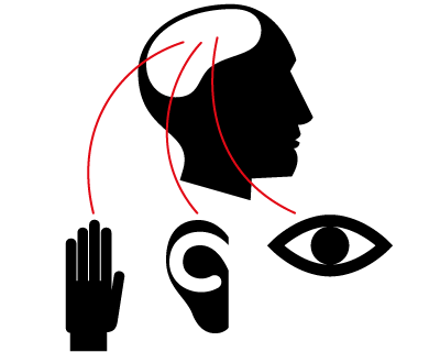
It’s a mere circle that took tactile and auditive shape. Now, you can give that circle velocity, temperature, hardness, harshness, size, etc. You can feel its taste or even imagine how it smells like.

Then, understanding that the visual shape depends on factors that acquire agreggate values as we give them to it, is something very complicated. Thus, giving the circle one more feature, is a very complex process of abstraction.

One step further
When we were little children, the teacher told us the “a” sound matched the “a” shape. And that the “a” shape wasn’t related at all to the “a” sound. Just unlike we were used to, when we would see the shape of a horse and matched it to the real horse.
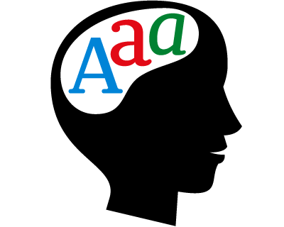
The complex shape we’re dealing with is just a small part trying to depict, in a neutral way, the concept we have of a horse. This small part will work if (and only if) it goes along the rest of the letters in a given sequence.

The designer and the evolution of writing
Going back to our last topic and facing the high complexity levels inherent to the written speech, we’ll be able to understand that we, as designers, frequently feel forced to re-invent writing over and over, to give it new values beyond what is visible. We’ll give it —for the time being— the name of abstract expression.
This kind of expression is everything but new and responds to a creative way of matching tangible concepts to abstract ideas. A couple of years ago, a Chilean pianist named Valentín Trujillo, used to work with a graphic artist whose name is Iván Arenas (also known as proffessor Rossa). When the proffessor was drawing he asked his friend (the pianist) to play a song about “cockroaches playing the ball”, in order to give ambience to what he was drawing. Unexpectedly, the pianist surprised us all with a melody that exactly matched the proffessor’s request. Weird? I don’t know, may be. I just came to my mind not long ago when I was asked to design a fat, fluffy and sensual typeface.How could I explain my client, a designer too, that an “a” has a very well defined shape and that any modification made to it will affect directly its legibility? It sure may be fat, but sensual?

Then the client-designer not only told me that I had the ability to give letterforms an added value, bot also that I knew how to do it. In other words, he meant that I could do with the shape what Valentín did with the piano. As soon as I got home I sat down, took paper and pencil and smiled surprised. Happy. Then I knew that typeface designers have to make their own palette of tricks on the run, and I felt kind of obliged to share a couple of secrets more about the shape, something I did in a former article.


Sensuality
At first, I attempted to look thoroughly for what defines the sensuality of a shape. However, it turned out much easier for me to understand those shapes that were NOT sensous in order to build the concept starting from that point.
Straight, hard, dry and broken lines mean to me something that is inert and dead, almost funerary. Therefore, all things opposite to square, would be sensous. The curve, the counter-curve, the course of sinous forms could all then be considered sensual. Interestingly, if a final definition of the sensual shape was determined, it wouldn’t be completely curve, but it would possess any element that would contradict it, instead. But not completely. Indeed, a curved tip could produce a break necessary so that not everything would be so “round”.


Aggressiveness
A concept such as aggressiveness is not as complex as the former and could be understood as the “killing attempt to sensuality”. Tips and sharp and broken straight lines can be easily recongnized as very violent visual shapes. On the other hand, it is commonly assumed that curves can very hardly be considered as aggressive.


Velocity

This is another not-so-complex concept since the repetition of slanted shapes can easily give us the sensation of speed. The more slanted the form, the stronger the sensation. Should the slant of the outlines be proggressive, we could have acceleration, besides speed in our shape.


Credibility
One of the concepts that directly influence on the credibility of shape is stability. It’s all about assuming that an equilateral triangle can be more believable than an obtuse one, that a circle can evoke more reliability than an ellipse, that an orthogonal line can be more rational than a slanted one, etc.
Thus we can understand that orthogonal shapes derivative from geometric regular or stable figures can produce more reliability and credibility.


Elegance
Slim, thin and fine shapes are generally linked to elegance, as thick and broad or strangely curved ones are considered common and mundane. Irregularly contoured shapes are considered dirty.


Disrespectfulness
This concept’s all about mixing languages in a random way or creating several simultaneous systems of formal correspondence, wich do not respond to a logic system.


The anarchist
Or the murder of shape, in this particular case. It’s about combining shapes derivative from a regular, altered, violated or contradicted geometry with shapes that don’t match the same language. Also superposing aggressive on elegant shapes in a heretic way, or creating hybrids uncapable to achieve a logic integration of opposite concepts.


Tackiness
Elegance have such very well defined limits that when you exaggerate or ignore them in a cartoonish way, your shape starts to turn tacky and mannered.


It could be rather complicated to keep on trying to match untangible qualities to visual shapes. Perhaps we could review examples until the last page of the dictionary. Besides, many shapes could depict much more than a single concept. For instance, widths, proportions, colors, techniques, materials, etc, perform an important role at creating either certain ambiences or visual systems as in the case of alphabets, dingbats pictographic systems, etc.


Special thanks by the translation of this article to Cesar Puertas, the new member of typies.

Thursday, January 25, 2007

Signs and Pictograms


Lately, many people have asked me about icons and pictograms. Then I realized how difficult it is for my students to be maintain consistency between the drawing and the concept behind it.
Usually, a pictogram works in 2 big areas: what it means and how we represent it. Those areas must always be in complete harmony, because any imbalance could alter the interpretation of the reader. Summing up, a bad sketching icon could ruin a good abstraction of a concept; and a bad abstraction will never transmit any concept at all, if we were to make a bad drawing. For the time being, we will talk just about the representation, the strength of typies…


A universal mistake among the graphic designers is to think that there is only one way to design icons: the ‘ballheads’ that Otl Aicher proposed a long time ago…
‘Do it yourself’… take those designs, do small modifications of them and… wow!!! You have a new pictograms system!!!.... Noooooo!!!!! But… Is there any way to design ‘really new’ icons? Let’s talk about design: If we think of a concept for an icons system, we must be able to identify 3 dimensions: style, simplicity and technique.
Let’s assume that we already created the abstraction of our concept and now we must think about ways of representing it (from now on, our concept will always be ‘woman’).


1. The Style
The style of the sign will show us how to solve it. We could design geometric and stiff icons, or maybe very complex pictograms. But at the moment of choosing the graphic style of our icon, it’s important to care about the system that we are going to use to print, cut or visualize this pictogram.
In the example, we could see two different solutions for the same abstraction (a frontal view of a woman with a skirt). The first solution is based on a grid, maybe pixels, that could suggest something related to technology. In the second one, the image of this woman is a more stylized silhouette. It captures coquetry. Here as well, the same silhouette is represented in two different ways.


2. Simplicity
At which level of simplicity could we communicate a concept? There are 8 different icons for the same concept in the example (woman):
-In the first one- maximum simplicity. Just 3 rectangles and 1 circle.
-In the second icon, the thickness variation and the curved shoulders make the process of recognizing the concept easier.
-Third icon: in this pictogram we add a new element: the diagonal.
-Fourth: we tried to draw a more geometric shape and make it more real.
-In the fifth example, we left out the arms and we modified the position axis of the woman. A simple action gives us more information: she is a woman, she’s got a skirt (and not ‘any’ skirt’) and she’s also got personality.
-In the sixth one, we moved away from geometry and we gave physical characteristics to the pictogram. Now, our woman has waist thickness legs, more real.
-Seventh pictogram: look at our woman, now we can talk about her build, attitude, physical curves and also about what kind of dress she is wearing…
-Finally, the eighth one is almost a reality representation.


3. Technique
This is a very decisive factor at the moment of choosing a style. It’s not the same thing to design something that is going to be printed, and to design something for the web, cell phones, displays. There are a lot of systems… maybe we are going to paint or carve it… and we must take this point into account at the moment of making design decisions.
The technique can determine how many colors we can use, the thickness of the sketch or its simplicity. (Click over the images to see them in real size).


Wednesday, December 06, 2006

Romeral, a display typeface

I’ve designed Romeral, a display typeface, in the beginning of 2004 in order to accompany my text typefaces.
Romeral is designed to produce a noticeable visual impact that invites the audience to the reading due to its sizable thickness.
Interestingly enough, the basic idea was to find a way to fill the color titles zone in order to create a comfortable atmosphere for the reading experience.
Nowadays, the complex typography of the typefaces makes it very hard for the designer to work with it comfortably. Romeral’s straight geometric form allows an amateur designer to modify its points without much difficulty The idea is to be able to easily design a personalized layout of the text.
The complementary "Inline" variation allows for alternative uses of the typeface. For example, it can be used as a base typeface.


I thank you in advance for your attention and support of the blog.

Thursday, November 30, 2006

15 tips to choose a good text type

Many people have asked me which text type is best for a magazine, a newspaper, a poster, a newsletter, a publication, etc. In general, I tell them which to use, but I know that this is not the best answer, because they won't learn to do this by themselves.
Today, I want to take time to analyze how to choose correct text typography design in different cases. It is very important to understand that these tips are not final word, but they can be good help at the moment of choosing a text type. In any case, it depends on what do you want to convey with this type, because many times legibility is as important as the character of the type. Try to be very careful and take in account the following points:


1. The Letterform
The ‘ductus’ represents the framework of a type. It is very important. For legible text we need typographies with a simple ductus without complex details. Those details distract from the reading process and we need the reader to pay attention to the content and not the text.


2. The Weight
When we discuss the ‘weight’ of a type, we refer to a consistent relationship between the characters themselves, and the light of the page that flows around them. If you use a light version of a type for a lot of text, reading of this text will probably become tiring and nobody will want to read it.


3. The Contrast
The contrast refers to the thickness difference between vertical and horizontal strokes. The difference between the thicker and the thinner part of the character. Bodoni and Didot are very contrasted type designs. Try to read the photocopy of a photocopy of a photocopy of text layed out in Bodoni. You will probably see only vertical strokes. Good type design should be able to resist a lot of copies. It must be strong, solid, but not coarse.


4. The axis
In my view, the axis of a type design could affect reading. Vertical strokes prevail in a text type and if the axis is diagonal, the eye will have trouble following that line of text. If the type uses more than one axis, a line of text will appear as if dancing which makes is harder to read. If we use an orthogonal axis, the characters can't dance.


5. x height
The area between baseline and x height contains most of the readable information (75% of the lower case letters). It is a very important area at the moment of reading text. Long ascenders and descenders require a small x hight. If we compare two types of designs, one with long ascenders and the other with short ascenders, we can see that the x height of the second one will be larger, so it will obviously be more legible. Look up for the difference between Times New Roman and Mrs. Eaves.


6. Capital letters height
Older typefaces designs consider the same height for the ascenders and the capital letters. In any cases capitals are bigger… But the appearance of a word in upper case between lower caps is usually ugly. When I write the word ‘Garamond’ I feel the ‘G’ as a dinosaur and the ‘a’ as its prey…


7. Endings and details
When we use a font in a big size (for example in a poster), we enlarge everything. All the small details of the type design become evident, as well as the mistakes. A lot of typographies are badly drawn. As designers, we should not accept this.


8. Text and texture
A block of text looks like a texture from a distance. This texture must be uniform, without thicker characters or spots that could attract the attention.


9. Degree of the Counter Opening
In many type designs, the counters are too closed. It could cause legibility problems, because somebody could read 'o' instead of an 'c'. So, if the internal counter is too opened (as in Frutiger), it will start to mingle with the external counter, generating a lot of white (and it looks ugly).


10. The Fish Effect
This effect becomes evident when the internal counter is bigger than the space between characters. It looks very strange where round and straight characters join.


11. External counter
There are small details that make a text type design more legible. A carefully designed external counter leads to better text understanding. Think about the connection between the vertical stroke of the ‘n’ and its curve, or the difference between ‘rn’ and ‘m’.


12. Internal counter
A small eye in an ‘a’ or an ‘e’ character will probably disappear, especially in small type sizes. These are the most used characters in most of the languages, that is why this becomes a very big problem.


13. Is the set complete?
How many times do we note that the font we are using lacks a character? It always happens when our design is almost finished. Terrible! We must change the type and check out the complete text again. Many type designers don't design some characters such as ñ, written accents, tildes, points, commas or numbers… It is better to check the font out before using it.


14. The family
It is important to verify that the type family is plentiful, with variations in weight, black, whites and italics… Check out that the italic is as legible as the regular version. Sometimes they have a lot of rococo details.


15. Letter spacing
There are fonts with bad or non-existent letter spacing and obviously, they don't work well. A good designer will try to correct the letter spacing that he (she) considers bad, but it is too much work when all the spacing looks bad… There are software packages that can help, but it is not the same as good typographer work. Try to use fonts with correct letter spacing and metrics…


Thursday, November 02, 2006

Vector drawing mistakes


Some time ago, I wrote an article about vector drawing. A basic explanation, but very helpful.
A few hours ago I was looking through some files on my computer and I found a lot of archives that I compiled during my student days in order to help my friends with their vector drawing works.
Vector drawing is a kind of art… In order to understand vectors, I can propose the following analogy, “Paths are like ropes- we must tug on them, if we want them to take shape. Curiously, most of the vector drawing mistakes stem from the ignorance of this concept. Some people use the point handles like the steering wheel of their cars: it doesn’t matter how the car turns around, the aim is to simply turn the car.
Thus, it is very common to find the following vector drawing mistakes (you can click on the images to see them in real size).


1. Extra points
Few will notice the changes when we place extra points in a straight path segment (in a line). The new line may be a little mucky :it is not perfect, and we know that.
It is more complicated if we place an extra point in a curved path:
we will probably notice a little bump in the place of the curve where the point is. This is one of the most common vector drawing mistakes: we forget to take the extra points off from the curved paths. Often, these points are waste of a ‘remove overlap’ action. In any case, the result is the same: we get bad resolution.


2. Misplaced point
If you are making a path and using your handles in 90º or 180º (orthogonal), make sure where you place the points. A misplaced point generally makes dirty curves.


3. Imbalanced point
Maybe the most frequent mistake… if your points are perfectly placed in the extremes of the curves and the handles are in orthogonal position, then why do you still see a dirty curve??? This occurs because of an imbalanced point: In a curve, the points on the right side must be like a mirror of the points on the left side… You must place them at the extremes of the curve, but THOSE EXTREMES must be in the right place of the path.


4. Wrong point selection
Corner point, connector point, curve point… we already talked about them in the last post (‘Vector drawing’). It’s very important to choose the correct kind of point when you are drawing a path… Bad selection point=bad resolution.


5. Imbalanced handles
Handles must be in orthogonal position, but you must be careful about how long those handles are… If the line is a rope, the point is the tightrope walker and the handles are the stick. An imbalanced stick could make you fall down!


6. The handles are not in orthogonal position
Try to use the handles orthogonally, you will note that it will be easier to draw your paths and those paths will become perfect (or “better”).


7. Extra handles
If you have a terminal curve point, take the handles off. They are not necessary and you will note that the curve looks cleaner.

8. (Bonus track) Working with arcs
If you are not sure about the correct position of the handles, use the arc tool of your vector drawing program, this tool make perfect curves and it is very helpful.


Special thanks to our friend Konstantin Shishkin, for all of his help