Signs and Pictograms
Lately, many people have asked me about icons and pictograms. Then I realized how difficult it is for my students to be maintain consistency between the drawing and the concept behind it.
Usually, a pictogram works in 2 big areas: what it means and how we represent it. Those areas must always be in complete harmony, because any imbalance could alter the interpretation of the reader. Summing up, a bad sketching icon could ruin a good abstraction of a concept; and a bad abstraction will never transmit any concept at all, if we were to make a bad drawing. For the time being, we will talk just about the representation, the strength of typies…
Usually, a pictogram works in 2 big areas: what it means and how we represent it. Those areas must always be in complete harmony, because any imbalance could alter the interpretation of the reader. Summing up, a bad sketching icon could ruin a good abstraction of a concept; and a bad abstraction will never transmit any concept at all, if we were to make a bad drawing. For the time being, we will talk just about the representation, the strength of typies…
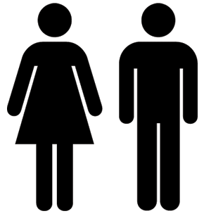 A universal mistake among the graphic designers is to think that there is only one way to design icons: the ‘ballheads’ that Otl Aicher proposed a long time ago…
‘Do it yourself’… take those designs, do small modifications of them and… wow!!! You have a new pictograms system!!!.... Noooooo!!!!! But… Is there any way to design ‘really new’ icons? Let’s talk about design: If we think of a concept for an icons system, we must be able to identify 3 dimensions: style, simplicity and technique.
Let’s assume that we already created the abstraction of our concept and now we must think about ways of representing it (from now on, our concept will always be ‘woman’).
 1. The Style
The style of the sign will show us how to solve it. We could design geometric and stiff icons, or maybe very complex pictograms. But at the moment of choosing the graphic style of our icon, it’s important to care about the system that we are going to use to print, cut or visualize this pictogram.
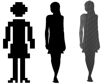
In the example, we could see two different solutions for the same abstraction (a frontal view of a woman with a skirt). The first solution is based on a grid, maybe pixels, that could suggest something related to technology. In the second one, the image of this woman is a more stylized silhouette. It captures coquetry. Here as well, the same silhouette is represented in two different ways.
 2. Simplicity
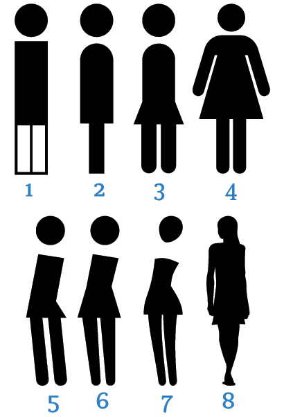
At which level of simplicity could we communicate a concept? There are 8 different icons for the same concept in the example (woman):
-In the first one- maximum simplicity. Just 3 rectangles and 1 circle.
-In the second icon, the thickness variation and the curved shoulders make the process of recognizing the concept easier.
-Third icon: in this pictogram we add a new element: the diagonal.
-Fourth: we tried to draw a more geometric shape and make it more real.
-In the fifth example, we left out the arms and we modified the position axis of the woman. A simple action gives us more information: she is a woman, she’s got a skirt (and not ‘any’ skirt’) and she’s also got personality.
-In the sixth one, we moved away from geometry and we gave physical characteristics to the pictogram. Now, our woman has waist thickness legs, more real.
-Seventh pictogram: look at our woman, now we can talk about her build, attitude, physical curves and also about what kind of dress she is wearing…
-Finally, the eighth one is almost a reality representation.
 3. Technique
This is a very decisive factor at the moment of choosing a style. It’s not the same thing to design something that is going to be printed, and to design something for the web, cell phones, displays. There are a lot of systems… maybe we are going to paint or carve it… and we must take this point into account at the moment of making design decisions.
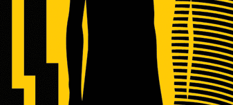
The technique can determine how many colors we can use, the thickness of the sketch or its simplicity. (Click over the images to see them in real size).


